Social Impact Internships: Tory Lentine (’23)
My name is Tory Lentine, and this summer I completed a Social Impact Internship with the Maine Department of Health and Human Services through the Office of Aging and Disabilities Services. My project was to create a Tableau dashboard displaying data relevant to the Age-Friendly State Plan to be displayed on the department’s site. Completing this work involved data collection and visualization, an understanding of the plan’s goals and areas of action, and collaborative teamwork.
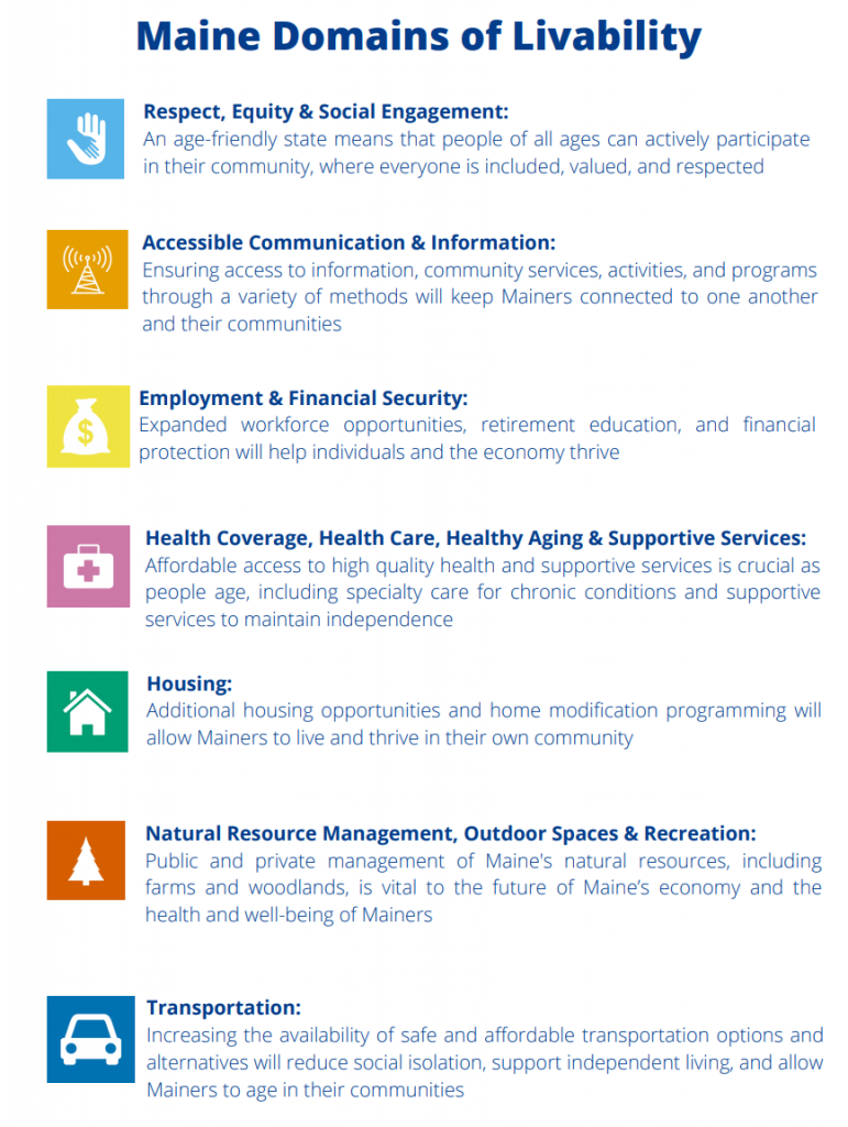
For my visual, I included a screenshot which outlines the seven “Domains of Livability” in the state plan. The reason I shared this is because these seven domains were the funnels by which we went about our data project. The goal of our dashboard was to share data, resources, and information relevant to the plan, which itself addresses the state’s efforts to support aging citizens in their communities. This is a broad goal affecting essentially all aspects of life for aging Mainers, so to split up our approach we saw the domains as a good place to start.
As we were to create this dashboard in Tableau, a data visualization program, it was essential that we found sufficient underlying data to include for each domain. Throughout the internship, we met with members of different departments of the state government to hear their thoughts on what data would be helpful for the various domains, and we were able to obtain datasets which we then formatted for our use. An important consideration throughout the process was understanding our target audience, and not just including general statistics and figures, but choosing those that tell a story, show progress, or could be of practical use to any or all viewers. In creating a product for our target audience it was also important to understand the user experience–the data had to be present and sufficient, but it was of no use if it wasn’t displayed in a pragmatic manner.
We faced barriers in many levels of the workflow. Sometimes there wasn’t enough information relevant to a specific domain, or there weren’t clear connections between different information sources that would allow a convenient display, or the information itself wasn’t quantitative in nature but qualitative instead. We had to begin constructing our dashboard before we knew what the finished product would look like as we hadn’t yet held meetings for all of the domains, so as we worked and obtained new sources, our vision had to be shaped continuously to best display our current resources. There were issues with obtaining the software itself, and in combining data from a variety of sources. We were tasked with assembling and displaying information for a plan with which we had only recently become familiar, and addressing a target audience regarding issues with which I had limited experience. However, through collaboration, asking questions of my supervisors and other department members, and taking the time to develop a thorough understanding of my task, I was able to meet the goal of my internship and assemble a useful product.
This work taught me about the nature of presenting data to a wide audience, and in particular what it takes to display information relevant to a social cause or social change. Our project was always to be outward-facing, so it had to be useful and not just a summary. As my internship went on I became more aware of the project’s needs and areas for improvement, which to me is a sign of deeper understanding and growth. I have learned a lot about the issues facing aging community members and the services provided by the state and through partnerships with other entities.

Tags: Civic Engagement, Health, Social Impact Internships, Social Impact Internships Summer 2021, Tech for Good
